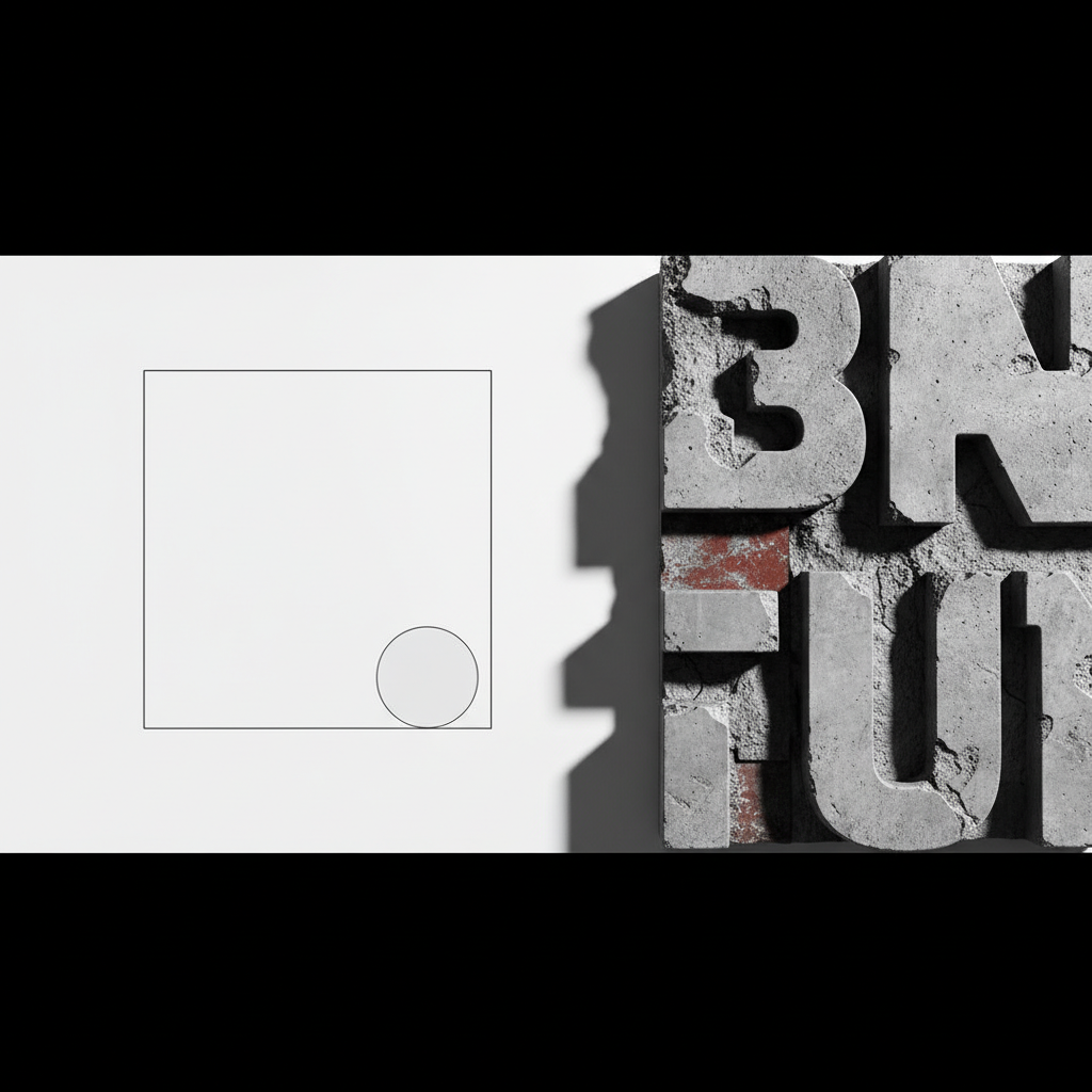
The contemporary web landscape is currently witnessing a fascinating collision between two seemingly opposing philosophies. On one hand, we have the refined, quiet elegance of reductionist aesthetics. On the other, the raw, unpolished, and often jarring impact of neo-brutalism. At OUNTI, we have spent the last decade navigating these shifts, observing how the most successful digital products are no longer those that follow a safe, corporate template, but those that embrace the tension between minimalist design and brutalist typography. This combination is not merely a visual trend; it is a strategic response to the oversaturation of "clean" but forgettable user interfaces that have dominated the last few years.
When we talk about minimalist design and brutalist typography, we are discussing the balance between breathability and authority. Minimalism provides the skeletal structure—the white space, the intentional hierarchy, and the removal of the superfluous. Brutalism, specifically through its typographic expression, provides the voice. It is loud, unapologetic, and functional. This duality allows brands to maintain a high level of sophistication while projecting a sense of honesty and raw power that resonates with a modern audience tired of overly polished marketing facades.
The Philosophy of Subtraction vs. The Aesthetic of Rawness
Minimalism in web design is often misunderstood as simply "having a lot of white space." True minimalism is an exercise in restraint and cognitive load management. According to research by the Nielsen Norman Group, reducing visual clutter significantly improves user task completion rates. However, the risk of pure minimalism is anonymity. If every site uses the same sans-serif font and the same generous padding, the brand identity evaporates. This is where the integration of minimalist design and brutalist typography becomes a transformative tool.
Brutalist typography takes inspiration from the architectural movement of the mid-20th century—raw concrete, exposed structures, and a total lack of concern for "prettiness" in favor of "truth." In a digital context, this translates to oversized headings, monospaced fonts that evoke early terminal interfaces, and a rejection of traditional kerning or leading rules. When placed within a minimalist frame, these heavy, structural characters do not feel messy; they feel deliberate. They act as the focal point, ensuring that the user’s attention is captured immediately and held firmly.
For complex technical projects, such as a web development for SaaS applications project, this approach is particularly effective. SaaS platforms often suffer from feature-rich interfaces that overwhelm the user. By utilizing a minimalist layout to organize the data and brutalist typography to highlight the primary calls to action or key metrics, developers can create a tool that feels both powerful and easy to navigate. It signals to the user that the platform is robust and data-driven, rather than just another "friendly" consumer app.
The Technical Execution of High-Contrast Layouts
Executing a layout that successfully blends minimalist design and brutalist typography requires a deep understanding of CSS Grid and Flexbox, but more importantly, an eye for optical balance. You cannot simply pick a heavy font and put it on a white background. You have to consider the "weight" of the letterforms. Brutalist fonts often have irregular shapes or "ink traps" that look striking at 120px but might become illegible at 16px. Therefore, the minimalist aspect must extend to the type scale itself—using fewer font sizes to create a more rhythmic and predictable reading experience.
At OUNTI, we often apply these principles to industries that are traditionally conservative. We have seen a significant shift in how specialized sectors approach their digital presence. For example, modern web design for insurance agencies is moving away from the "happy family" stock photography and toward a more authoritative, text-driven aesthetic. By using minimalist design and brutalist typography, an insurance firm can project transparency and reliability. The "raw" nature of the typography suggests a brand that doesn't need to hide behind decorative fluff, which is a powerful message in the financial services sector.
The use of color in this hybrid style is also critical. While minimalism often leans toward neutrals, the brutalist influence allows for the strategic use of "safe" colors (like neon greens, stark reds, or pure blues) used sparingly. These high-contrast accents, when paired with massive black type and plenty of negative space, create a visual rhythm that guides the eye through the conversion funnel without the need for traditional buttons or distracting shadows.
Geographic Influences and Global Design Trends
Design does not exist in a vacuum; it is influenced by the cultural and architectural surroundings of the creators and their clients. We see the impact of minimalist design and brutalist typography across various regions where we operate. For instance, in our work surrounding Casoria design projects, there is an increasing demand for interfaces that reflect a modern, European industrial sensibility—combining the historical appreciation for solid structure with the modern need for digital speed.
Similarly, the aesthetic has found a unique home in coastal and evolving markets. When we look at the creative output for Los Realejos digital solutions, we see a bridge between the natural landscape’s simplicity and the urban desire for bold, technological expression. This global trend suggests that the "minimal-brutalist" hybrid is not just a niche preference but a universal evolution of the web’s visual language. It scales well, it loads fast (due to fewer heavy assets like images and videos), and it performs exceptionally well on mobile devices where screen real estate is at a premium.
Breaking the Grid without Breaking the UX
One of the most exciting aspects of working with minimalist design and brutalist typography is the opportunity to "break" the grid. Conventional web design relies on a 12-column grid that keeps everything neatly aligned. Brutalism encourages us to push elements to the very edge of the viewport or to overlap text and images in a way that feels organic and slightly rebellious. However, as experts, we know that breaking the grid must be done with purpose.
The minimalism provides the "safety net." If the navigation is clear and the hierarchy is logical, the designer can afford to be experimental with the typography. You might have a headline that spans the entire width of the screen, clipping off the edges of the characters, provided that the secondary information remains perfectly legible and accessible. This creates a sense of "digital texture"—a feeling that the website is a living, breathing entity rather than a static document.
Furthermore, this style is inherently accessible when done correctly. High-contrast type is easier for visually impaired users to read, and the lack of complex animations or "scroll-jacking" ensures that the site remains performant on lower-end hardware. By focusing on the core elements—typography and space—we are essentially returning to the roots of the web, but with the sophisticated tools of the modern era. The result is a website that feels timeless, yet aggressively contemporary.
Ultimately, the marriage of minimalist design and brutalist typography is about confidence. It takes a confident brand to strip away the gradients, the shadows, and the stock imagery to let the message stand on its own. At OUNTI, we believe that this is the direction the high-end web is moving. It is a move away from the "polite" design of the mid-2010s and toward an era of clarity, impact, and structural integrity. Whether we are building a complex SaaS platform or a localized corporate site, these principles ensure that the final product is not just seen, but felt.