In the early days of the web, layout was a struggle of table hacks and float manipulation. As someone who has spent over a decade architecting digital interfaces at OUNTI, I have seen the transition from fragile hacks to the robust, native layout systems we use today. The debate often centers on CSS Grid vs Flexbox: when to use each. Many developers treat them as rivals, but the reality is far more nuanced. They are complementary tools designed to solve different classes of layout problems. Understanding the fundamental philosophy behind each is what separates a junior coder from a senior architect.
The core distinction lies in dimensionality. Flexbox was designed for one-dimensional layouts—either a row or a column. CSS Grid, conversely, was built for two-dimensional layouts, handling both rows and columns simultaneously. While this sounds simple, the implications for performance, maintainability, and responsiveness are profound. When we approach a project, such as our specialized web design for architecture studios, we often rely on Grid to maintain the strict visual rhythm and structural integrity that architectural portfolios demand.
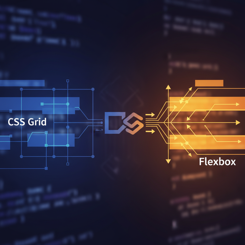
The Content-First Approach of Flexbox
Flexbox is inherently content-oriented. When you use Flexbox, you are telling the container to distribute its children based on their size and the available space. It is the ideal tool when you do not know exactly how much content will be inside a container or how wide that content will be. Flexbox excels at alignment and space distribution along a single axis. If you need to center an icon inside a button, create a navigation bar where items are spaced evenly, or build a flexible card component where the footer always stays at the bottom, Flexbox is your primary weapon.
One of the most powerful features of Flexbox is its ability to "flex." The flex-grow, flex-shrink, and flex-basis properties allow items to expand to fill extra space or shrink to prevent overflow. This fluidity is essential for UI elements that must adapt to varying text lengths across different languages. For instance, when developing functional interfaces like web design for motorcycle workshops, we use Flexbox for scheduling widgets and service lists where the amount of data can vary significantly from one entry to the next.
However, Flexbox begins to fail when you try to force it into a rigid 2D grid. Developers often try to simulate grids by using percentages and flex-wrap, but this leads to "widows"—single items on the last row that don't align with the columns above them. If your design requires items to line up both horizontally and vertically, Flexbox is likely the wrong choice.
The Layout-First Philosophy of CSS Grid
CSS Grid is a structural powerhouse. Unlike Flexbox, Grid is layout-first. You define the grid tracks (rows and columns) on the parent container before you even place the children inside. This allows for a level of control that was previously impossible without heavy JavaScript or fragile absolute positioning. According to the MDN Web Docs on Grid Layout, Grid is the first CSS module created specifically to solve layout problems that we had been hacking with other methods for years.
Grid introduces the fr unit (fractional unit), which represents a fraction of the free space in the grid container. This is a game-changer for responsive design. Instead of calculating percentages and subtracting margins, you can define a column as 1fr and let the browser handle the math. Grid also excels at overlapping elements. Since you can explicitly place items into specific grid cells or areas, you can easily stack elements without relying on complex negative margins or z-index hacks.
For large-scale structural layouts, such as a full-page dashboard or a complex magazine-style homepage, Grid is indispensable. When we work on regional projects, providing high-end web design in Santa Pola, we use Grid to create immersive, asymmetrical layouts that remain perfectly stable across all device sizes. The ability to use grid-template-areas makes the code incredibly readable; you can literally see the map of your layout in your CSS.
Comparing the Technical Mechanics
To master these tools, you must understand how they handle space. Flexbox calculates the size of the items first and then decides how to distribute the remaining space. Grid defines the space first and then places the items into that space. This is why Grid is much better for "top-down" design, while Flexbox is better for "bottom-up" component logic.
Consider the "gap" property. For years, this was a Grid-exclusive feature, allowing you to define gutters between items without the side effects of margins. While gap has now been implemented for Flexbox in most modern browsers, Grid still holds the advantage in complex spacing. With Grid, you can use align-content and justify-content to control the entire grid's position, while also using align-self and justify-self on individual items to override their placement. Flexbox lacks a justify-self property on the main axis because the items are treated as a collective group rather than independent units in a pre-defined space.
Another major difference is the concept of "Subgrid." Subgrid allows a child element to inherit the grid tracks of its parent. This solves the age-old problem of aligning content across different cards (like making sure the headers and buttons of three side-by-side cards always line up perfectly). While Flexbox can't do this, Grid's subgrid feature makes it the ultimate tool for complex, nested data visualization.
Choosing the Right Tool for the Job
The question shouldn't be "Grid or Flexbox?" but rather "How can I use both?" At OUNTI, we typically use Grid for the overall page layout—the header, sidebar, main content area, and footer—and then use Flexbox for the components inside those grid areas. This hybrid approach leverages the strengths of both systems. For our international clients seeking modern web solutions in Pozzuoli, we emphasize this modularity to ensure that the site is easy to maintain as it grows.
Use Flexbox when:
- You have a small, one-dimensional collection of items.
- You want the size of the content to determine the layout.
- You need to vertically or horizontally center a single element.
- You are building a navigation bar, a breadcrumb trail, or a simple button group.
Use CSS Grid when:
- You have a complex, two-dimensional layout.
- You need to align items precisely in both rows and columns.
- The layout requires overlapping elements.
- You want to use the power of
frunits andauto-fit/auto-fillto create truly fluid galleries without media queries.
The Impact on Performance and Maintenance
From a senior perspective, we also consider the long-term maintenance of the codebase. Over-using Flexbox to create grids results in "div-itis"—nesting endless containers to simulate rows and columns. This bloats the HTML and makes the CSS harder to debug. Grid allows for a much flatter HTML structure, which improves accessibility and rendering performance. The browser’s layout engine can calculate a Grid much more efficiently than a series of nested Flexbox containers trying to emulate the same behavior.
Furthermore, CSS Grid makes responsive design significantly cleaner. With the grid-template-areas property, you can redefine your entire page layout for mobile in just a few lines of code inside a media query, moving the sidebar to the bottom or reordering the header without touching the HTML markup. This separation of concerns is vital for high-performance agencies like OUNTI, where speed and flexibility are paramount.
In conclusion, CSS Grid and Flexbox are the twin pillars of modern layout. Mastering the "Grid vs Flexbox: when to use each" dilemma is about recognizing whether you are organizing content or building a skeleton. By using them in tandem, you create web experiences that are not only visually stunning but also technically superior, scalable, and resilient to the ever-changing landscape of device sizes.