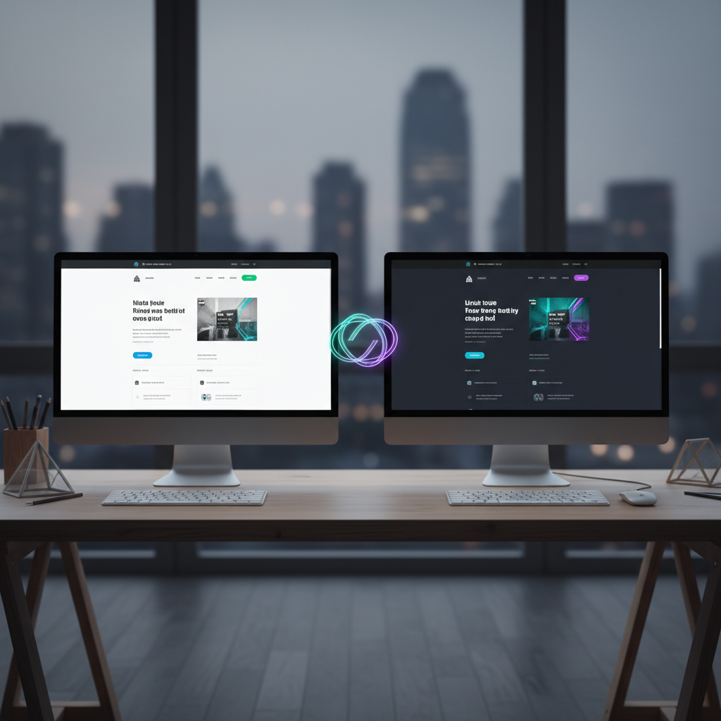
For the past decade, we have witnessed a fundamental shift in how users consume digital content. The era of "paper-white" backgrounds by default is over. As a senior architect at OUNTI, I have watched dark mode evolve from a niche developer preference into a mandatory standard for high-end digital products. Implementing dark mode in web design is no longer just about flipping a toggle or inverting a CSS filter; it is a sophisticated exercise in color theory, optical psychology, and energy management. When we approach a project today, we are not just designing for a static environment; we are designing for the user’s circadian rhythm and the physical limitations of their hardware.
The transition to dark interfaces was accelerated by the mass adoption of OLED and AMOLED screens. Unlike traditional LCDs, where a backlight is always on, OLED pixels emit their own light. When a pixel is black, it is effectively turned off, consuming zero power. This technical nuance changed the stakes for mobile-first strategies. By integrating a thoughtful dark mode in web design, we are directly contributing to the battery longevity of a user’s device, which in turn increases session duration and reduces bounce rates. It is a rare intersection where technical performance and user experience (UX) find perfect alignment.
The Physiology of Light and the "Halation Effect"
One of the most common mistakes junior designers make when tackling dark mode in web design is using pure black (#000000) for backgrounds and pure white (#FFFFFF) for text. From a senior perspective, this is a cardinal sin. High contrast sounds beneficial in theory, but in practice, it causes significant eye strain known as the halation effect. This occurs when very bright text "bleeds" into a dark background, making the characters appear blurry or glowing to the human eye, particularly for users with astigmatism. To mitigate this, we utilize deep grays and desaturated tones which provide the necessary depth without the optical vibration of pure black.
Our work for clients across various sectors requires a tailored approach to these visual hierarchies. For instance, when developing a digital presence for businesses looking for bespoke solutions in innovative design projects in Cerveteri, we focus on surfacing information through subtle elevation rather than harsh borders. By using lighter shades of gray to indicate elements that are "closer" to the user, we create a 3D sense of space that feels natural and intuitive. This depth-focused design language is what separates a professional dark interface from a DIY attempt.
Accessibility and the WCAG Standard in the Dark
Accessibility is the cornerstone of modern development. The Web Content Accessibility Guidelines (WCAG) dictate specific contrast ratios that must be maintained for readability. However, dark mode introduces a unique challenge: color perception changes based on the surrounding luminance. A vibrant blue that looks professional on a light background might become "electric" and vibrating on a dark one, failing accessibility checks and hurting the user's vision. We must desaturate colors to ensure they remain legible while maintaining the brand's identity.
When we look at specialized niches, the requirements become even more stringent. Consider the visual clarity needed for an aesthetics centers website. In this context, the dark mode must convey luxury and cleanliness. We cannot simply use a generic dark theme; we must curate a palette of charcoal, obsidian, and soft gold that remains accessible while evoking the premium feel of a physical spa or clinic. Every hex code is tested against the W3C Web Accessibility Initiative standards to ensure that no user is left behind, regardless of their visual acuity or environmental lighting.
The Technical Architecture of Theme Switching
From an engineering standpoint, implementing dark mode in web design has been revolutionized by CSS Custom Properties (variables). In the past, we relied on heavy JavaScript libraries to swap stylesheets, which caused a "flash of unstyled content" (FOUC) that ruined the premium feel of a site. Today, we utilize the `prefers-color-scheme` media query to detect the user’s system settings automatically. This allows the website to respect the user's global preference from the very first millisecond of the page load.
For large-scale platforms, such as a comprehensive web design for language academies, we build a scalable design system. We define a set of semantic tokens—colors named by their function rather than their hue (e.g., `--bg-primary` instead of `--white`). When the theme switches, only the values of these tokens change. This ensures that the entire site remains consistent, whether the student is studying at noon or during a late-night session. This architectural foresight is what allows OUNTI to deliver products that are easy to maintain and evolve as the brand grows.
Branding Challenges and Visual Consistency
A recurring question from our clients, including those seeking a competitive edge through modern digital strategies in Cartagena, is how to preserve brand recognition in a dark environment. The logo is usually the biggest hurdle. A logo designed for a white letterhead often disappears on a dark header. Our solution involves creating "responsive logos" or using subtle glow effects and strokes to ensure the brand mark remains prominent without appearing tacked on. It is about harmony, not just visibility.
Furthermore, imagery must be treated differently. A bright, high-key photograph can be jarring when the rest of the interface is dark. We often implement "image dimming" via CSS filters for dark mode users. By slightly reducing the brightness and increasing the contrast of photographs, we ensure the images blend into the dark theme rather than acting as a light source that blinds the user. This level of detail is what defines a truly expert application of dark mode in web design.
Ultimately, the dark mode is not a toggle; it is a philosophy of respect for the user's context. Whether they are browsing in a brightly lit office or in a dim bedroom, the interface must adapt to provide the best possible experience. At OUNTI, we treat the dark interface as a primary citizen of the design process, ensuring that every element—from the smallest icon to the largest hero section—is optimized for clarity, beauty, and performance. As we look toward the future, the boundaries between the digital and physical worlds will continue to blur, and dark mode will remain a critical tool in our arsenal to create comfortable, sustainable, and high-converting web experiences.
Designing for the dark requires a deep understanding of how light works on a screen and how the brain interprets that light. It requires a balance between the technical constraints of the browser and the emotional impact of the color palette. By moving away from the standard "white-label" approach and embracing the complexities of dark mode in web design, we provide our clients with a digital product that is not only modern but also future-proof. It is an investment in user retention, accessibility, and brand prestige that pays dividends in every click.