In a digital landscape where the average professional receives over a hundred emails a day, the difference between a click and a deletion rests entirely on the sophistication of your newsletter design. Having spent over a decade navigating the evolution of web standards and digital communication at OUNTI, I have seen the "email blast" transform from a simple text-based notification into a complex, multi-layered brand experience. The challenge today isn’t just getting an email delivered; it’s about commanding attention in a saturated environment. Newsletter design is no longer just about aesthetics; it is about cognitive load management, technical resilience across fragmented clients, and strategic narrative flow.
Most agencies treat email as a secondary thought, a mere extension of a website’s CSS. This is a fundamental mistake. A website is a destination where the user has already expressed intent. An email is an intrusion into a personal space. To respect that space, the design must be impeccable. It requires a deep understanding of how users scan content under pressure. We don’t read emails; we triage them. Therefore, the visual hierarchy must be engineered to provide the most value in the first 2.5 seconds of interaction. If the focal point is muddy or the call-to-action is buried, the design has failed, regardless of how "pretty" it looks.
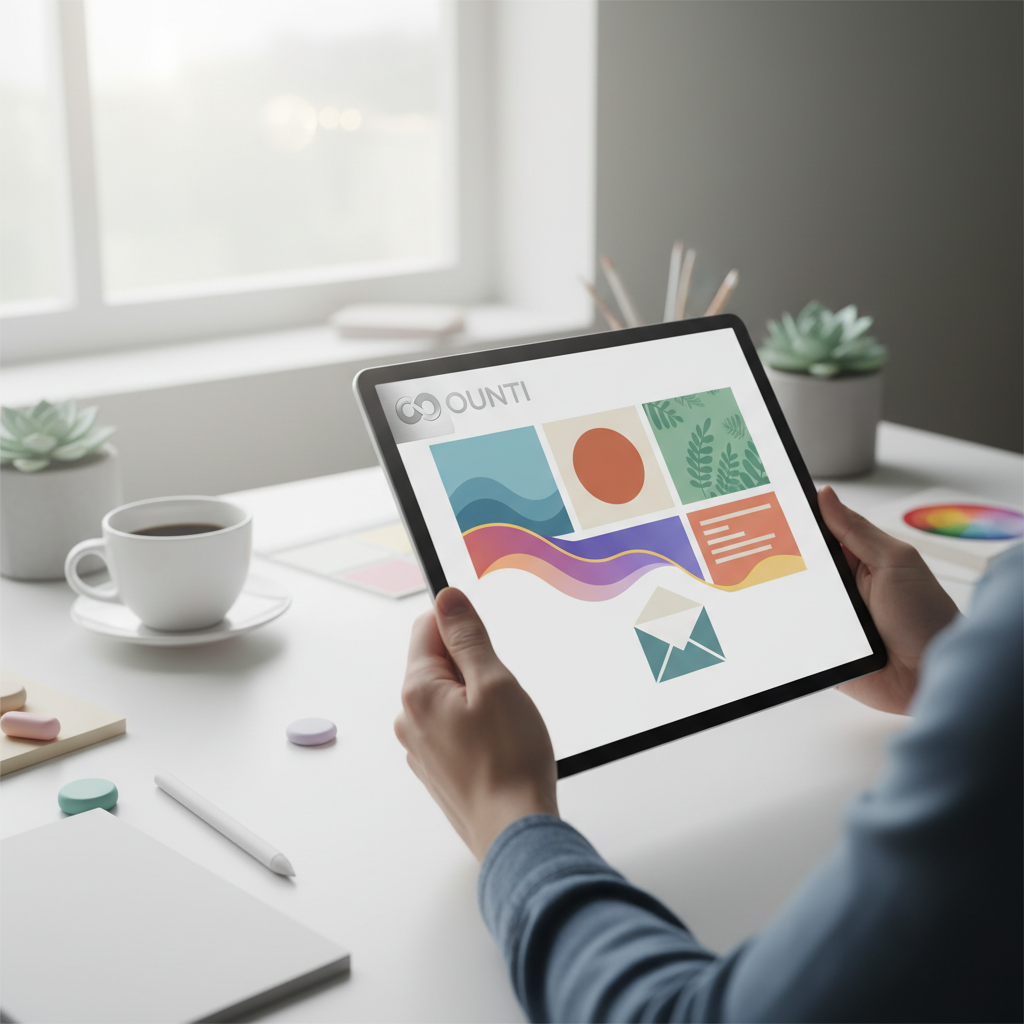
The Invisible Grid: Why Layout Logic Dictates Conversion
Every successful newsletter design starts with a rigorous grid system. Unlike modern web development where Flexbox and Grid allow for fluid, dynamic layouts, email coding is a journey back in time to table-based structures. This technical constraint often frustrates junior designers, but for a senior expert, it provides a disciplined framework. A single-column layout remains the king of mobile responsiveness, ensuring that whether a user is checking their phone in a cafe or on a train, the content remains legible and the click targets remain accessible. This is particularly relevant for local businesses looking to expand their digital footprint. For instance, when we develop a lugar Benalmádena focused digital strategy, the newsletter must bridge the gap between local charm and professional global standards.
White space is your most powerful tool in this grid. It isn't "empty" space; it is active space that guides the eye from the headline to the supporting imagery and finally to the conversion point. Without proper padding and gutter management, a newsletter feels claustrophobic, triggering a cognitive "skip" response in the reader. We must also consider the "inverted pyramid" method—a design pattern that starts with a wide, attention-grabbing element and narrows down to a specific, singular action. This psychological funnel is the backbone of high-converting campaigns.
Furthermore, the typography must be bulletproof. While web fonts are increasingly supported, the fallback system is where the true design expertise lies. A newsletter that looks beautiful in Apple Mail but breaks in Outlook is a liability. We must select font stacks that maintain the brand’s soul even when the primary typeface fails to load. The balance between system fonts and brand-specific imagery is a delicate dance that defines the longevity of a newsletter design strategy.
Accessibility and the Universal User Experience
Accessibility in newsletter design is frequently overlooked, yet it is a critical component of both ethical design and commercial reach. A significant portion of your audience may be viewing your content with screen readers or may have visual impairments that make low-contrast text impossible to read. According to the Nielsen Norman Group, users often skim newsletters even more aggressively than they do web pages, making clear headings and high-contrast visuals even more vital. We implement ALT text not just for SEO or "broken image" placeholders, but as a narrative tool that describes the visual experience to those who cannot see it.
This level of detail is especially important for professional sectors. Consider the precision required when crafting a Página web para gestorías y asesorías or their subsequent email communications. These industries rely on trust, clarity, and authority. A newsletter that is difficult to navigate or fails to meet accessibility standards immediately undermines the perceived professionalism of the firm. Color contrast ratios, large tap targets (at least 44x44 pixels), and logical heading structures are non-negotiable elements of a senior-level design approach.
Beyond the visual, we must consider the "Dark Mode" challenge. Over 50% of users now browse in dark mode, and a newsletter design that hasn't been optimized for this will look like a glaring white rectangle or, worse, will have logos that disappear into the black background. Translucent PNGs and specific CSS media queries for prefers-color-scheme are essential tools in our arsenal to ensure the brand remains consistent regardless of the user’s device settings.
Decoding the Outlook Paradox: Coding for the Toughest Client
Any veteran in this industry will tell you that the biggest hurdle in newsletter design isn't the creative—it's Microsoft Outlook. Because Outlook uses the Word rendering engine rather than a web-standard engine like WebKit, it ignores many modern CSS properties. This is where the technical expertise of a senior developer at OUNTI becomes indispensable. We utilize "ghost tables" and MSO-specific code to ensure that the layout holds together in the most restrictive environments. This rigorous testing phase is what separates a professional agency from a freelancer using a basic template.
When we look at international markets or specific regions like the lugar Marano de Nápoles, we see that technical standards can vary by the most commonly used local ISP or enterprise software. A robust newsletter design must be battle-tested against a myriad of combinations. This includes managing background images which often fail in Outlook unless they are coded using Vector Markup Language (VML). It’s a tedious process, but it’s the only way to guarantee that your brand’s visual integrity is preserved for every single subscriber.
The weight of the email also matters. If your HTML file exceeds 102kb, Gmail will "clip" the message, hiding your footer and, more importantly, your unsubscribe link and tracking pixel. This not only hurts your analytics but can also negatively impact your sender reputation. Optimization is about more than just compressing images; it’s about writing clean, efficient code that delivers the maximum impact with the minimum weight.
Vertical Markets and Bespoke Email Strategies
The strategy behind newsletter design must shift based on the industry. A B2B advisory firm needs a design that emphasizes readability and thought leadership, whereas a B2C service provider needs high-energy visuals and immediate calls to action. For example, a Web para lavanderías autoservicio might use newsletters to announce promotions or maintenance updates. In this case, the design should be functional, clean, and highly mobile-centric, reflecting the "on-the-go" nature of the customer base.
We approach each project by identifying the "North Star" metric of the newsletter. Is it click-through rate? Is it brand sentiment? Is it direct sales? The design is then reverse-engineered from that goal. For high-frequency newsletters, we develop modular design systems. This allows the client to "plug and play" different content blocks—videos, testimonials, product grids—without breaking the overarching design aesthetic. This modularity ensures brand consistency while reducing the time-to-market for each campaign.
Interactive elements are the next frontier. While support is still fragmented, including CSS-based hovers, carousels, or even simple polls can significantly increase engagement. However, as an expert, I always advocate for a "progressive enhancement" strategy: provide a cutting-edge experience for those on modern clients like Apple Mail, but ensure a rock-solid, functional fallback for those on older systems. This ensures no subscriber is left behind.
Ultimately, newsletter design is the art of balancing technical limitations with creative ambition. It is about understanding that the inbox is a crowded, competitive, and highly personal space. By combining rigorous grid logic, deep technical knowledge of email clients, and a user-centric approach to accessibility, we create newsletters that don't just get opened—they get remembered. At OUNTI, we don't just send emails; we build digital bridges between brands and their communities, one pixel-perfect layout at a time.