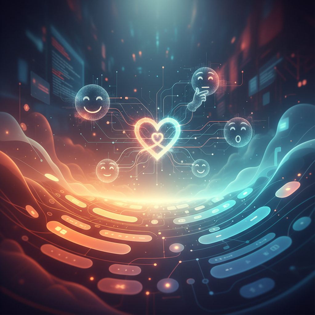
For over a decade, the conversation around web development has been dominated by performance metrics, load times, and SEO algorithms. While these technical foundations are non-negotiable, they represent only the skeleton of a digital presence. As a senior architect in the digital space, I have observed a profound shift in how users interact with interfaces. We are moving past the era of mere utility and entering a sophisticated age where emotional design on the web dictates the success or failure of a brand. It is no longer enough for a site to work; it must feel. It must resonate with the subconscious layers of the human brain that process trust, joy, and frustration long before the rational mind identifies a "Call to Action" button.
When we talk about emotional design, we are referencing a framework popularized by pioneers like Don Norman, which categorizes user experience into three distinct levels: visceral, behavioral, and reflective. In my ten years of refining the OUNTI philosophy, I’ve seen that the most successful projects are those that balance these three pillars to create a cohesive psychological journey. A user doesn't just "visit" a website; they inhabit it for a period of time. Our job as designers and developers is to ensure that this inhabitation is pleasant, intuitive, and ultimately memorable.
The Visceral Layer: The Five-Second Impression
The visceral level is entirely subconscious. It is the immediate, "gut" reaction a person has when your page first renders. This happens in less than 50 milliseconds. At this stage, the brain is not looking for information; it is assessing safety, beauty, and relevance. This is where color theory, typography, and visual hierarchy perform their heaviest lifting. For a luxury brand, the visceral reaction should be one of exclusivity and calm. For a creative agency, it might be one of energy and disruption.
Consider the emotional weight of specific niches. For example, creating a web for yoga and pilates centers requires a visceral approach rooted in serenity. If the page is cluttered or the colors are jarringly aggressive, the user’s nervous system will reject the platform before they even read about the class schedules. The design must embody the "Zen" it promises. We use soft transitions, expansive whitespace, and a palette that mimics natural elements to lower the user's cortisol levels the moment they land.
This immediate connection is universal, yet it must be localized to resonate with specific cultural aesthetics. Whether we are executing a project for a client in a bustling tech hub or focusing on web design in Elda, the visceral cues must align with the local expectations of quality and professionalism. A visceral failure—such as a dated layout or broken images—is interpreted by the brain as a lack of credibility, a barrier that even the best marketing copy cannot overcome.
Behavioral Design: The Joy of Seamless Functionality
Once the user survives the initial visceral judgment, they move into the behavioral stage. This is the domain of usability and "flow." In the context of emotional design on the web, behavioral satisfaction comes from the feeling of mastery and the absence of frustration. When a navigation menu is exactly where you expect it to be, or when a form validates your input in real-time without refreshing, you feel a sense of harmony. Frustration, on the other hand, is a powerful negative emotion that triggers a "flight" response, leading to high bounce rates.
According to the Nielsen Norman Group, user delight is often the result of removing friction. As an expert, I argue that delight also comes from micro-interactions—those tiny animations that acknowledge a user's action. A button that subtly depresses when clicked or a progress bar that moves with a "liquid" animation provides a tactile satisfaction that makes the digital interface feel responsive and alive. It transforms a cold transaction into a conversation.
In specialized sectors, behavioral design is even more critical. If we are developing a web for music schools, the behavioral flow must mimic the fluidity of music itself. The interface should allow potential students or parents to browse instruments, view faculty bios, and book a trial lesson with a rhythmic ease. If the booking process is a discordant mess of pop-ups and dead ends, the emotional link to the "art" of the school is severed. Usability is the highest form of respect you can show your user.
The Reflective Layer: Building Long-Term Brand Loyalty
The final and deepest level of emotional design is the reflective layer. This is where the user thinks back on their experience and forms a lasting opinion. Do they feel smarter for having used your site? Do they feel like they belong to a community? This is the level of "storytelling" and brand identity. It is where we move from "User Experience" (UX) to "Human Experience" (HX). Reflective design is what makes a user recommend a service to a friend or return to a site even when they don't have an immediate need to buy.
This level is heavily influenced by the "peak-end rule," a psychological heuristic which suggests that people judge an experience largely based on how they felt at its peak (the most intense point) and at its end. For a web developer, this means the checkout confirmation page or the "Thank You" message after a contact form is just as important as the homepage. It is the final emotional note you leave them with. In historical or culturally rich contexts, such as our work for clients in Città di Castello, the reflective design often taps into a sense of heritage and timelessness, ensuring the digital interface feels like an extension of a storied physical presence.
The Role of Empathy in Modern Development
To truly master emotional design on the web, one must move beyond the "user persona" and look at the "user's state of mind." Are they coming to this site in a hurry? Are they anxious? Are they looking for inspiration? A website for an emergency plumber should look and feel very different from a website for a boutique perfume house, even if they use the same underlying code framework. The former needs to project absolute reliability and speed (lowering anxiety), while the latter needs to project mystery and allure (heightening desire).
We achieve this through "Empathy Mapping." Before a single line of CSS is written at OUNTI, we ask: What is the user feeling when they search for this service? If the answer is "overwhelmed," our design strategy focuses on radical simplicity and reassuring language. If the answer is "curious," we use interactive storytelling and immersive imagery. This psychological alignment is why some websites "just feel right" while others feel "off," even if the "off" sites are technically perfect in terms of W3C standards.
Accessibility as an Emotional Necessity
There is an often-overlooked emotional component to accessibility. When a site is not accessible to people with visual or motor impairments, the emotion generated is one of exclusion. In my decade of experience, I’ve realized that inclusive design is not just a legal requirement; it is an emotional statement. It says, "We value you." High-contrast ratios, screen-reader-friendly layouts, and keyboard navigation options ensure that the positive visceral and behavioral experiences are available to everyone. When you design for the margins, you improve the experience for the center. A clean, accessible site feels better to every user because it communicates clarity and intentionality.
In conclusion, the future of the web isn't just faster—it’s more human. As algorithms take over the mundane tasks of SEO and code optimization, the true differentiator for brands will be their ability to connect on a visceral, behavioral, and reflective level. By integrating emotional design on the web into every stage of the development lifecycle, we create digital spaces that do more than just exist; they inspire, comfort, and convert through the power of human psychology. At OUNTI, we don’t just build websites; we engineer experiences that leave a mark on the heart, not just the browser history.